Design System Bonfire
Overview
Roadpass Digital operated five distinct products, each built on different technological foundations including React, React Native, WordPress, and Ruby on Rails. To address the challenges arising from this diversity, a cross-functional team developed “Bonfire,” a unified design system aimed at supporting all platforms, streamlining processes, and fostering consistency across all products.
Challenge
The company faced several critical issues:
- Individual product teams were reinventing solutions for identical problems
- Inconsistent user experience across platforms confused users
- Resource strain due to redundant efforts
- Difficult onboarding process for new team members
- Lack of shared design language hindering collaboration
- Multiple tech stacks requiring different implementation approaches
- Absence of engineering leadership support
- Limited resources and tight deadlines
Prototyping & Testing
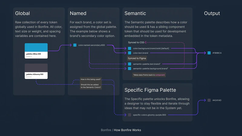
A critical phase of developing Bonfire involved extensive prototyping to ensure the system could seamlessly adapt to each brand’s unique requirements. Given that we were integrating brands that evolved independently—each with their own tech stacks, design patterns, and team cultures—we needed to validate that our theming approach could accommodate these differences without creating additional work for product teams.
Process
Before diving into development, I established a planning process centered around weekly collaborative workshops. These sessions brought together key stakeholders including:
- Chief Technology Officer
- Head of Design
- Technical Engineering Lead
- Design Systems Lead (myself)
Using FigJam as our virtual whiteboarding tool, I ran these workshops to:
- Map out dependencies between components and features
- Prioritize work based on immediate team needs
- Identify potential technical challenges early
- Align on implementation approaches across platforms
- Create detailed roadmaps for phased rollout
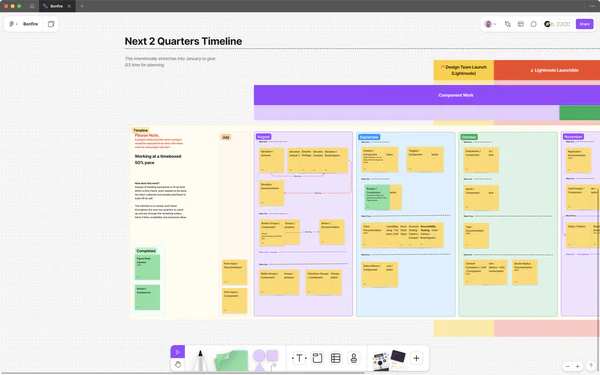
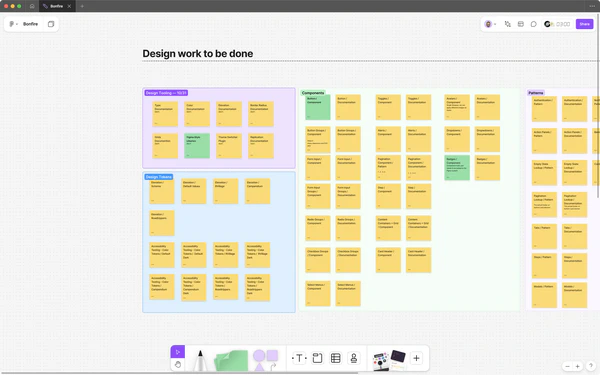
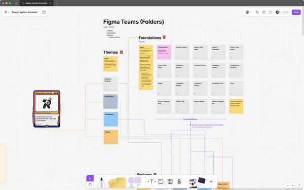
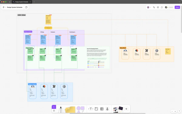
This collaborative approach ensured we had strong buy-in from leadership while maintaining realistic timelines and technical feasibility for the engineering teams who would be implementing the system.
The prototyping process focused on several key areas:
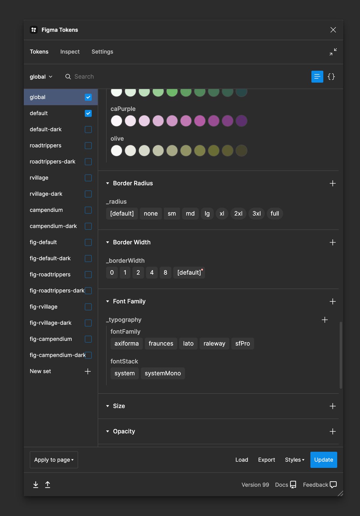
- Theme Switching Architecture
- Built multiple proof-of-concepts to test different theming approaches
- Validated that design tokens could properly cascade across all platforms
- Ensured brand-specific overrides wouldn’t break shared components
Cross-Platform Compatibility
- Created test implementations across React, React Native, and Rails
- Verified that components maintained visual consistency across platforms
- Developed fallback patterns for platform-specific limitations
- Performance Testing
- Measured bundle size impact of different theming solutions
- Tested theme switching performance on lower-end devices
- Optimized token delivery to minimize runtime overhead
Hundreds of Iterations & Tests
We refined our approach until we had a system that could:
- Preserve each brand’s unique identity while sharing core components
- Support seamless switching between themes without code changes
- Maintain performance standards across all platforms
- Enable gradual adoption without disrupting existing workflows
This extensive prototyping phase was crucial in building confidence among stakeholders and ensuring that Bonfire could truly serve as a bridge between our diverse product ecosystem.
Solution
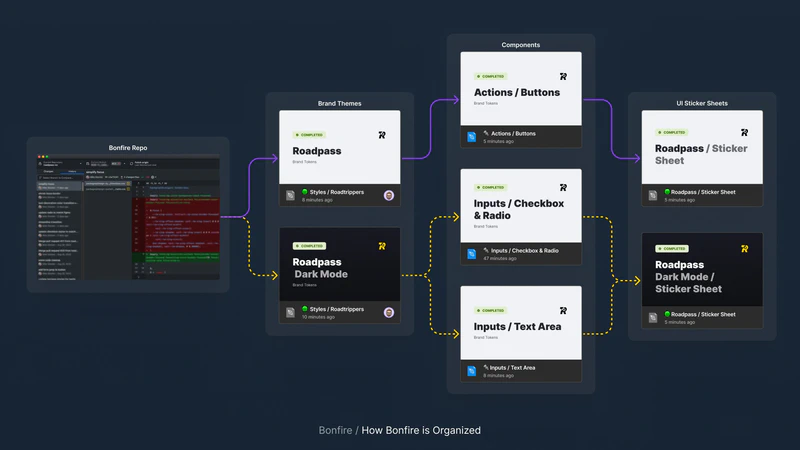
The team developed Bonfire as a comprehensive design system with the following key components:
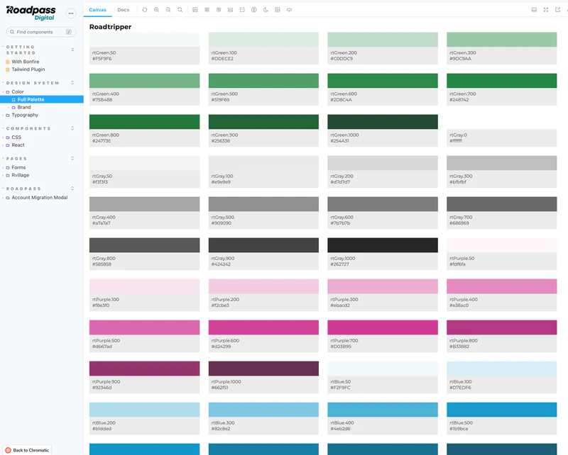
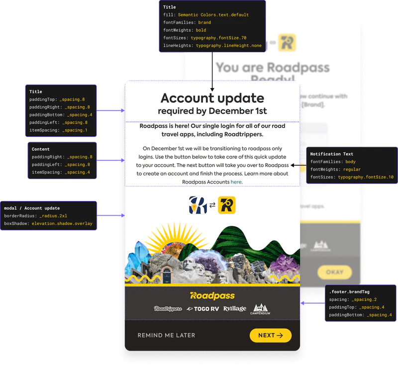
- Design tokens for centralized control of colors, typography, and spacing
- Bonfire Tailwind Plugin for quick implementation and cross-brand theming
- Library of 14 atomized components in Figma and Storybook
- Support for multiple tech stacks (React, React Native, vanilla HTML/CSS/JS)
- Open contribution model for company-wide participation
- Detailed documentation in Storybook and Figma libraries
- Accessibility-first approach in design implementation
Impact
The implementation of Bonfire delivered significant measurable results:
Efficiency Improvements:
- 80% reduction in feature completion time per platform
- Multi-platform support for 5+ platforms simultaneously
- Reduced QA resource requirements
Adoption and Standardization:
- 64% increase in design system adoption
- Established as company standard with continued use
Accessibility Enhancements:
- Reduced accessibility issues from 500,000+ to just hundreds
Financial Benefits:
- Annual savings of $143,000
- Design Team Savings: $54,600
- Engineering Team Savings: $88,400
Collaboration Benefits:
- Improved speed and efficiency reported by both design and development teams
- Enhanced cross-team collaboration
- Streamlined design and development processes
Project Gallery
